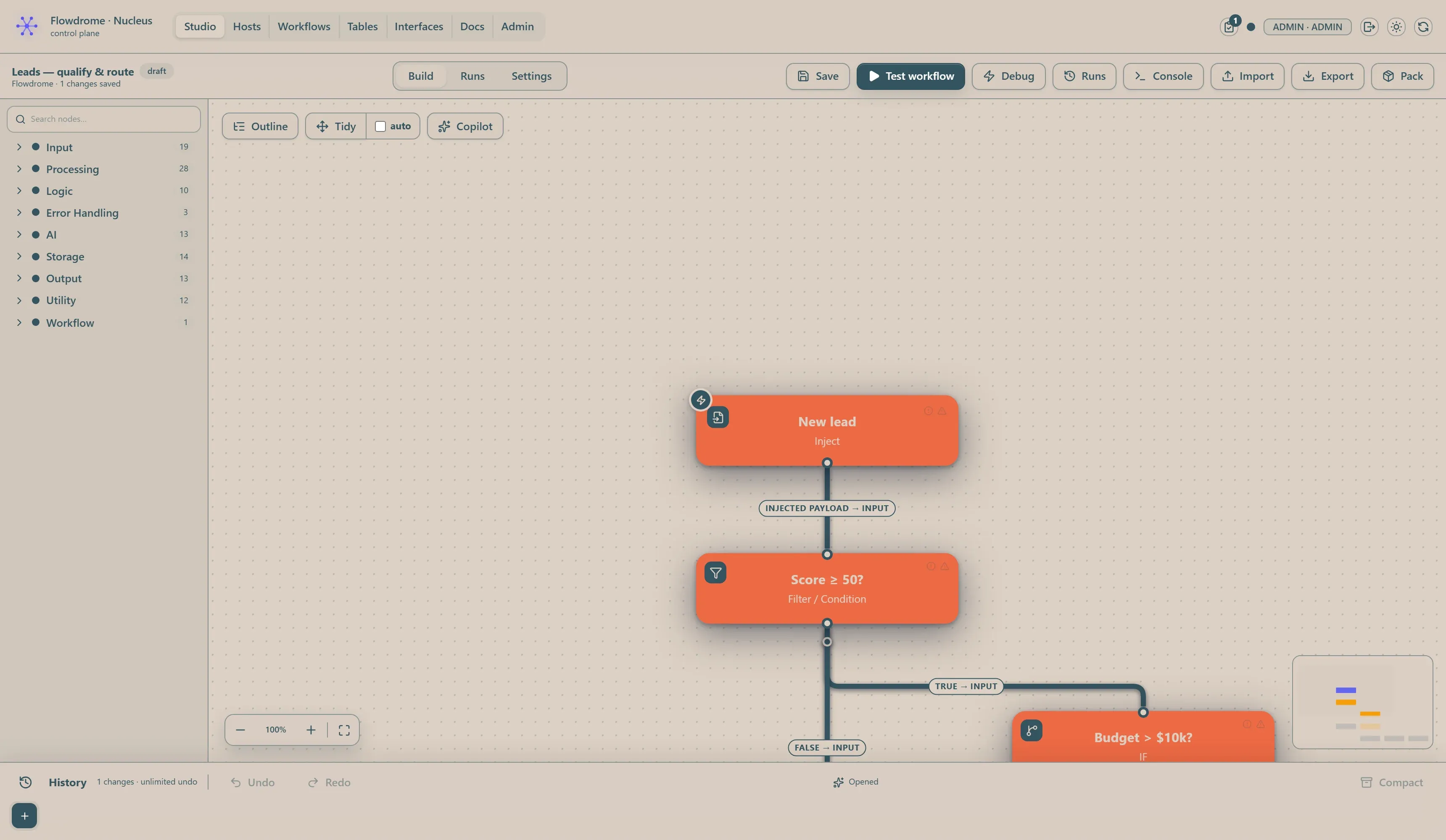
Appearance & themes
Flowdrome ships four app themes. The theme switcher — the icon at the top-right of the header — cycles through them: light → dark → blueprint → run, and back to light. The icon always previews the theme a click will take you to (a moon means dark is next, a ruler means blueprint, a runner means run).
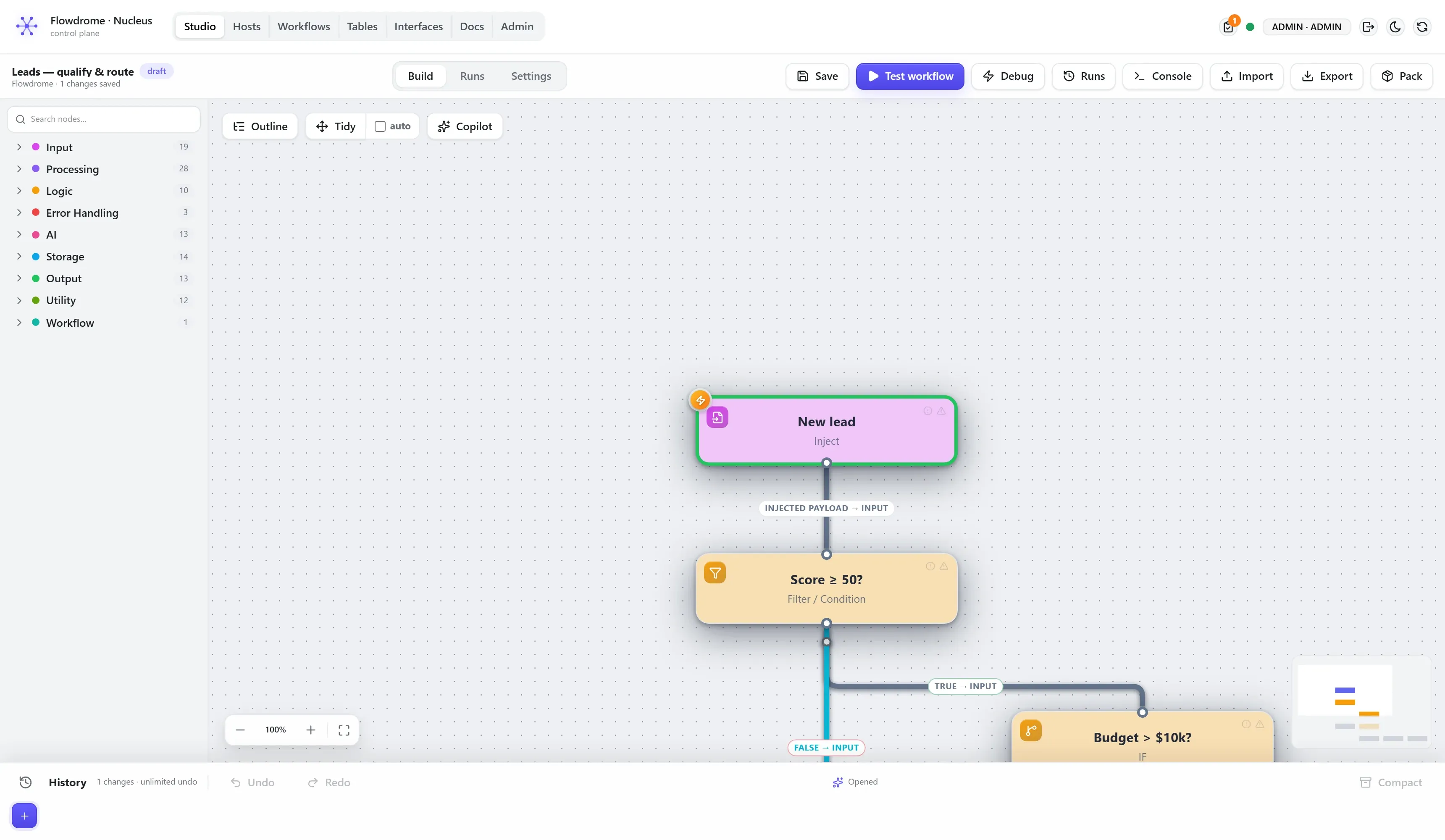
Light
The default light scheme — white surfaces, the indigo brand accent, full colour throughout the Studio: category colours in the library, per-route line colours on the canvas, semantic green/amber/red for success, warnings, and errors.
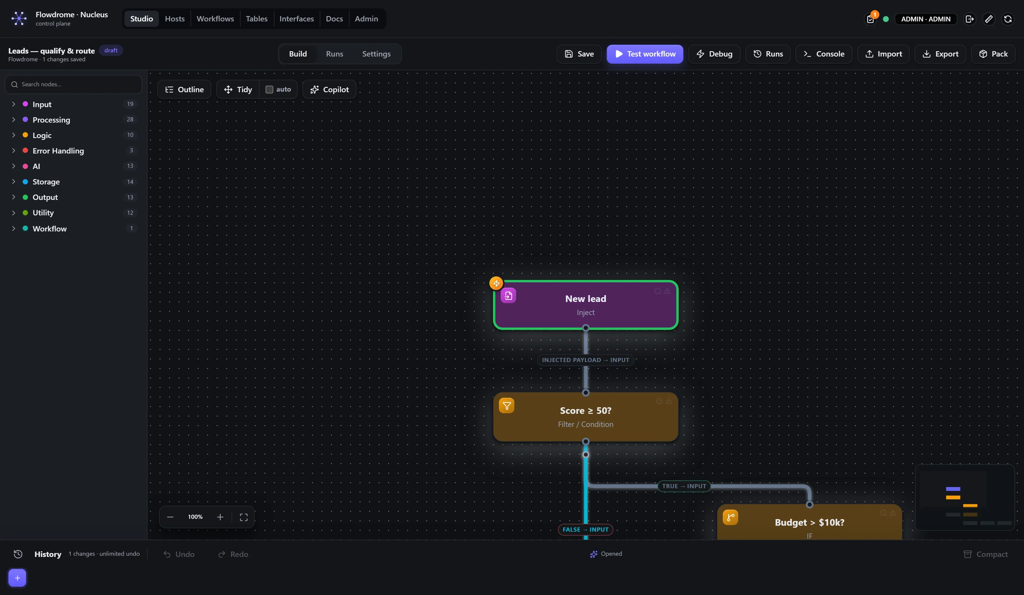
Dark
The same layout on dark surfaces — the default the product ships with.
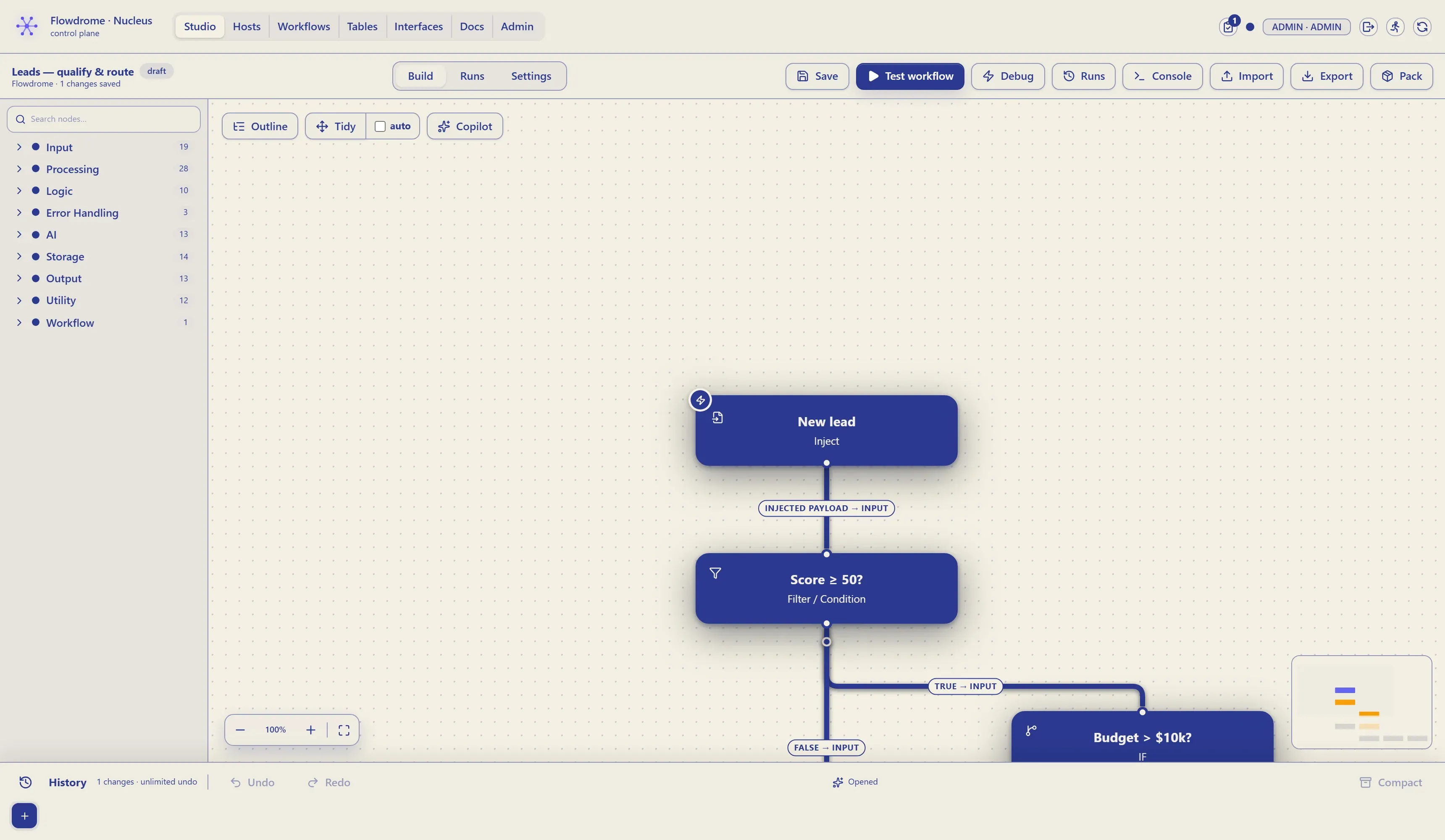
Blueprint
A two-colour paper theme, styled like a technical drawing: an off-white sheet and one blue — and nothing else. Every surface, every line, every piece of text is one of the two colours or a mix of them. Nodes are solid ink stamps with paper text; wires, chips, badges, code editors, even success/warning/error states collapse to the ink. If it isn’t the paper, it’s the blue.
Run
A second paper theme with one deliberate exception: a warm off-white sheet, a slate-blue ink for all text and chrome — and orange, reserved exclusively for the workflow nodes. Everything that isn’t a node obeys the same two-colour law as blueprint; the nodes are the one thing on the board allowed to break it.